Happy reading SN.
Donald Trump’s Lack of Respect for Science Is Alarming
-
Rorschach

- Posts: 14801
- Joined: Wed Jun 06, 2012 5:25 pm
Re: Donald Trump’s Lack of Respect for Science Is Alarming
DOLT - A person who is stupid and entirely tedious at the same time, like bwian. Oblivious to their own mental incapacity. On IGNORE - Warrior, mellie, Nom De Plume, FLEKTARD
-
Rorschach
- Posts: 14801
- Joined: Wed Jun 06, 2012 5:25 pm
Re: Donald Trump’s Lack of Respect for Science Is Alarming
Oh and on a double peer reviewed report by scientists...
The conclusion of the report is that the U.N.’s IPCC has exaggerated the amount of global warming likely to occur due to mankind’s emissions of CO2, and the warming that human civilization will cause as a result “is likely to be modest and cause no net harm to the global environment or to human well-being.” The primary, dominant cause of global climate change is natural causes, not human effects, the report concludes.
DOLT - A person who is stupid and entirely tedious at the same time, like bwian. Oblivious to their own mental incapacity. On IGNORE - Warrior, mellie, Nom De Plume, FLEKTARD
-
Rorschach
- Posts: 14801
- Joined: Wed Jun 06, 2012 5:25 pm
Re: Donald Trump’s Lack of Respect for Science Is Alarming
DOLT - A person who is stupid and entirely tedious at the same time, like bwian. Oblivious to their own mental incapacity. On IGNORE - Warrior, mellie, Nom De Plume, FLEKTARD
-
Rorschach
- Posts: 14801
- Joined: Wed Jun 06, 2012 5:25 pm
Re: Donald Trump’s Lack of Respect for Science Is Alarming
http://www.c3headlines.com/2014/07/stat ... uence.html
Happy for you to restart yet another proper debate on it SN...
Happy for you to restart yet another proper debate on it SN...
DOLT - A person who is stupid and entirely tedious at the same time, like bwian. Oblivious to their own mental incapacity. On IGNORE - Warrior, mellie, Nom De Plume, FLEKTARD
-
IQS.RLOW

- Posts: 19345
- Joined: Mon Mar 08, 2010 10:15 pm
- Location: Quote Aussie: nigger
Re: Donald Trump’s Lack of Respect for Science Is Alarming
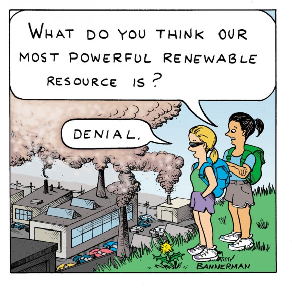
You can't convince a denialist. Global warming is SNs religion.
He just 'believes'
He just 'believes'
Quote by Aussie: I was a long term dead beat, wife abusing, drunk, black Muslim, on the dole for decades prison escapee having been convicted of paedophilia
-
Rorschach
- Posts: 14801
- Joined: Wed Jun 06, 2012 5:25 pm
Re: Donald Trump’s Lack of Respect for Science Is Alarming
SN?????

DOLT - A person who is stupid and entirely tedious at the same time, like bwian. Oblivious to their own mental incapacity. On IGNORE - Warrior, mellie, Nom De Plume, FLEKTARD
-
Rorschach
- Posts: 14801
- Joined: Wed Jun 06, 2012 5:25 pm
Re: Donald Trump’s Lack of Respect for Science Is Alarming
ARGO data...

DOLT - A person who is stupid and entirely tedious at the same time, like bwian. Oblivious to their own mental incapacity. On IGNORE - Warrior, mellie, Nom De Plume, FLEKTARD
-
Rorschach
- Posts: 14801
- Joined: Wed Jun 06, 2012 5:25 pm
Re: Donald Trump’s Lack of Respect for Science Is Alarming
Oh and SN you know how the alarmist believers are all saying 2016 is the hottest year on record and that there is no pause etc...
Well this year isn't over so far and in comparison to 1998... the hottest months have been hotter.... but the colder months have been colder.... and yes El Nino has been a factor in both years and... I guess we'll just have to wait till 2017 before we know eh.
Well this year isn't over so far and in comparison to 1998... the hottest months have been hotter.... but the colder months have been colder.... and yes El Nino has been a factor in both years and... I guess we'll just have to wait till 2017 before we know eh.
DOLT - A person who is stupid and entirely tedious at the same time, like bwian. Oblivious to their own mental incapacity. On IGNORE - Warrior, mellie, Nom De Plume, FLEKTARD
-
Super Nova

- Posts: 11794
- Joined: Sat Dec 15, 2007 12:49 am
- Location: Overseas
Re: Donald Trump’s Lack of Respect for Science Is Alarming
OK I'll bite.
You guys are so full of climate change denial you just ignore reputable sources and go with what suits your agenda.
Let's see what NASA just published in a reputable rag.
Go here for full article with the graphs. : http://blogs.scientificamerican.com/sa- ... isualized/
The Hottest Weather Ever Visualized
New data graphics offer an alarming view of global climate change
According to new data published by NASA, July 2016 was the hottest month our planet has seen since we started recording temperatures 136 years ago. In fact, every month since October 2015 has set a new record compared to previous years. But since July is generally the warmest month of the year globally, the latest data signals a record among records. So, what does this data look like? If you ask me, it’s the most alarming rainbow I’ve ever seen.
Each year since 1880 is represented by a line on the graph, with the points marking the average temperature for each month. The numbers on the vertical axis represent the deviation in degrees Celsius compared to data collected from 1980 to 2015. The rainbow scale denotes time, with the earliest years represented in blue, and the most recent in red. It’s easy to pick out the record-setting months since last October, as they stand well apart from the tangle of lines below.
As scary climate-related data visualizations go, this one is in good company. A few months ago, climate scientist Ed Hawkins published a now-famous animated graphic of “spiraling global temperatures.” (After being shared widely online, it was apparently featured during the opening ceremony of the Olympics in Rio!) A recent update incorporates data up to May 2016.
Always remember what you post, send or do on the internet is not private and you are responsible.
-
Super Nova
- Posts: 11794
- Joined: Sat Dec 15, 2007 12:49 am
- Location: Overseas
Re: Donald Trump’s Lack of Respect for Science Is Alarming
Always remember what you post, send or do on the internet is not private and you are responsible.
Who is online
Users browsing this forum: No registered users and 3 guests